Most people become anxious and sweaty when faced with overwhelming numbers and statistics. But somehow, charts make statistics fun. It’s a colorful way to understand data, from helpful information to random facts. We’re not sure what it is about charts – whether it’s the colors or the visualizations – but they’re an excellent way to learn new things. We’re not talking about information such as optimizing revenue over the next few months, but rather how the alphabet evolved or which are the most common birthdays. So, if you like colors and statistics, we suggest you stick around and enjoy this list of insightful charts!
#1: The Perfect Password Doesn’t Exi-
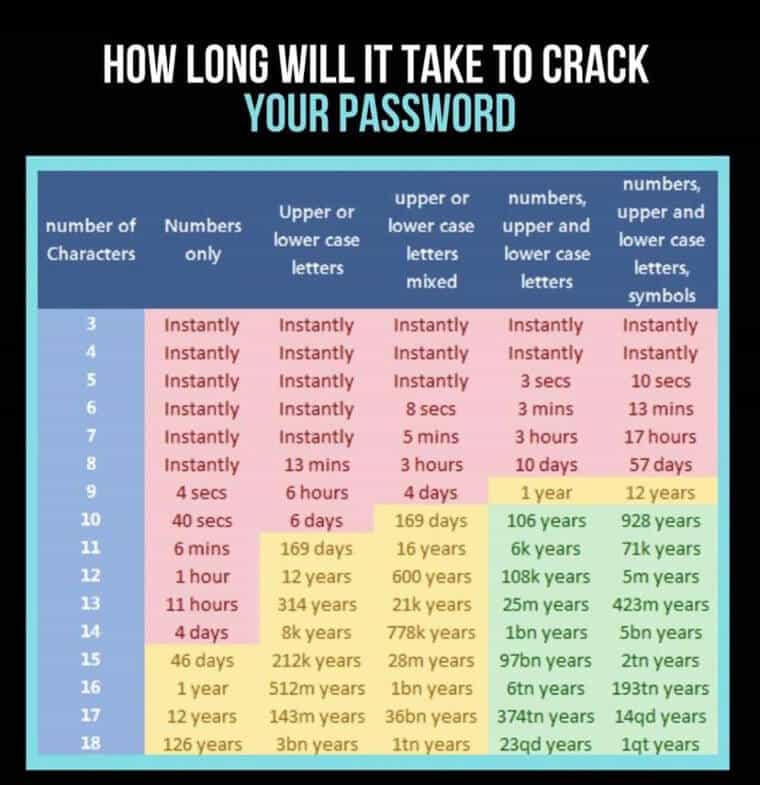
Creating passwords is always a hassle, especially since we must remember them afterward. But we might want to put more effort than just using the numbers one through eight or our birthdates. This chart shows how long it would take for someone to hack into your account if they wanted to.

The time it would take to hack your account depends on the types of characters and lengths of your passwords. Suppose you need to keep something private – mix numbers, upper- and lower-case letters, and symbols. This way, with a password of more than 12 characters, it takes a computer more than five million years to hack you.