
Personally, I’m not a big fan of numbers and statistics – and I know I’m not the only one. Most people become anxious and sweaty when faced with overwhelming numbers and statistics. But somehow, charts make statistics fun. It’s a colorful way to understand data, from useful information to random facts. I don’t know what it is about charts – whether it’s the colors or the visualizations – but they’re a nice way to learn new information. We’re not talking about information such as optimizing revenue over the next few months, but how the alphabet evolved or which are the most common birthdays. So, stick around and enjoy this list of insightful charts!

#1: Think Before You Ink
Whether you’re new to body ink or about to get yet another tattoo, you may want to take a look at this chart first. It shows which areas of the body are most painful with a useful color-coded graphic. As shown below, areas of the body colored in red or orange will hurt the most, and those in blue and yellow the least.
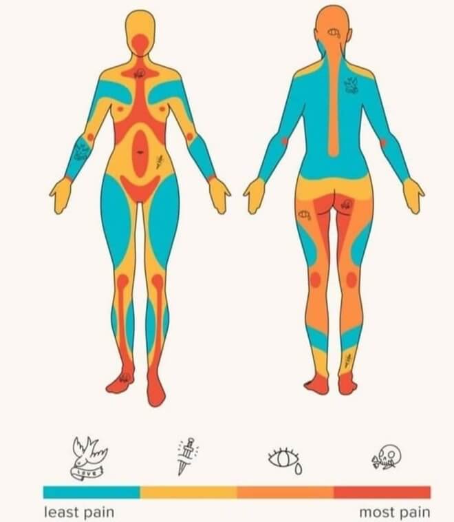
If you’re not good with pain, you should stay clear of tattooing feet, the center of the chest, or the more private areas. Luckily for us, most of the back is not so painful to tattoo, and the arms and thighs, too, since these are popular areas. Maybe that’s the reason why these areas are so popular? Is it a cause-and-effect thing?